Sprout Music Festival
Music festivals come in all different styles, from EDM, rap, country, and many more! It’s a place for thousands of passionate people to come and celebrate their passion. However, music festivals miss the spotlight for our younger generations. Kids may not be interested in the latest Taylor Swift album but are perfectly content listening to “Let it Go” from Disney Studios.
So why not give our kids an immersive experience that is fostered towards them as well? In my design, I aim to create a music festival where parents and adult figures can bring their little ones to an experience they won’t forget. My work focuses on creating visual designs alongside a mobile interface for a festival that younger kids would get to experience.
Role:
Course Project
Visual Designer
Researcher
Persona Creation / Customer Journey
Timeframe:
September 2023 - December 2023
Design Journey
🌱
Design Journey 🌱
Jump Ahead To:
In the research process for my festival, I took inspiration from events like:
Rolling Loud
Capital Hill Block Party
EDC Las Vegas.
Research & Competitor Analysis:
Looking to see what garnishes attention for those festivals, I noticed how each festival mentions all ages welcome. Inferring to how children can come and enter the event. I thought about how festivals that are tailored towards children are not common in mainstream media, so I wanted to create a core value proposition and unique selling point to promote children's engagement in safe and appropriate festival culture.
Personas:
After conducting research & analysis, 3 user personas were created to envision different scenarios and positionality to the music festival move forward toward the design phase:
Jonah - The Girl Dad
Jonah, a girl dad to his daughter Katie, who enjoys engaging with her interests. Lately, Katie has taken an interest in music and wants to attend a concert or festival.
Jonah aims to create memorable experiences for Katie while ensuring the content is age-appropriate and aligns with her current interests.
Olivia - Youth Counselor
Olivia is an afterschool youth counselor for an elementary school, with 3 children in her program. Providing valuable life lessons and everlasting memories, she supports her students in any way possible.
Olivia wanted to reward her students for working so hard by taking them to an accessible festival that would be orientated toward their interests.
Jaylen - Family Content Creator
Jaylen is a content creator who posts review videos online. Regarded as the top creator of the year, his content mainly focuses on family life and experiences.
Jaylen stumbled upon Sprout Music Festival and thought that it was an exciting opportunity to review the festival for families while spending quality time with his own family.
Ultimately, Olivia’s persona was the ideal candidate going forward in this project, creating a captivating journey to explore as I wanted to encourage participation & representation of unique positionality for possible users
After generating the personas, the Sprout logomark was created to invoke the sensation of softness, while conveying the ideas of playfulness. Wanting to attract younger children and families, it was important to highlight the qualities of the term “Sprout” by creating:
Curly and rounded terminals.
A little sprout leaf on the ‘o’ to further emphasize its openness.
Wordmark & Logomark
For the final colors in my festival, I used analogous color schemes, where the soft tones extend the goal of conveying softness and playfulness. Steering away from harsher tones in my palette.
Colors:
Ensuring that my colors remained accessible and visible for users to navigate through, heavier use of background colors used ‘Kombu Green’ & ‘Corn Silk’ as the foreground. With a high contrast ratio, it ensures that users will not struggle with visibility.
For smaller background use, ‘Corn Silk’ is used as the foreground to ‘Axolotl’. This combination would differentiate my design while still maintaining a visible contrast.
In later iterations of my logomark, color was included to embody the soft and playful spirit and tone that ‘Sprout’ represented for the festival. When presented with a background, it used an olive green as the logomark utilized a lighter cream color.
After finalizing the logomark and colors for the festival, I created a poster with all the lineups and headlines to bring the festival to fruition. I opted for more of a simplistic hierarchy-styled approach. Having the user read the poster from top to bottom, the poster was designed with the idea of:
The top 1/3 of the poster signals the important location and dates.
While the middle section of the poster would highlight the lineups and performances for those specific days.
The bottom third of the poster highlights performances that are happening every day
With the final poster design, users would easily distinguish one piece of information from another and its importance.
Music Festival Poster:
In the first iterations of my icons, I wanted to continue the leaf motif throughout my festival design. However, through user feedback it as deemed:
Too busy & overwhelming
Issues w/ visibility to users
After iterating through my final design, I removed the leaf that encapsulated the icons and enlarged them. These icons were rounded and smooth which still carried the soft tone of the festival.
Iconography Set:
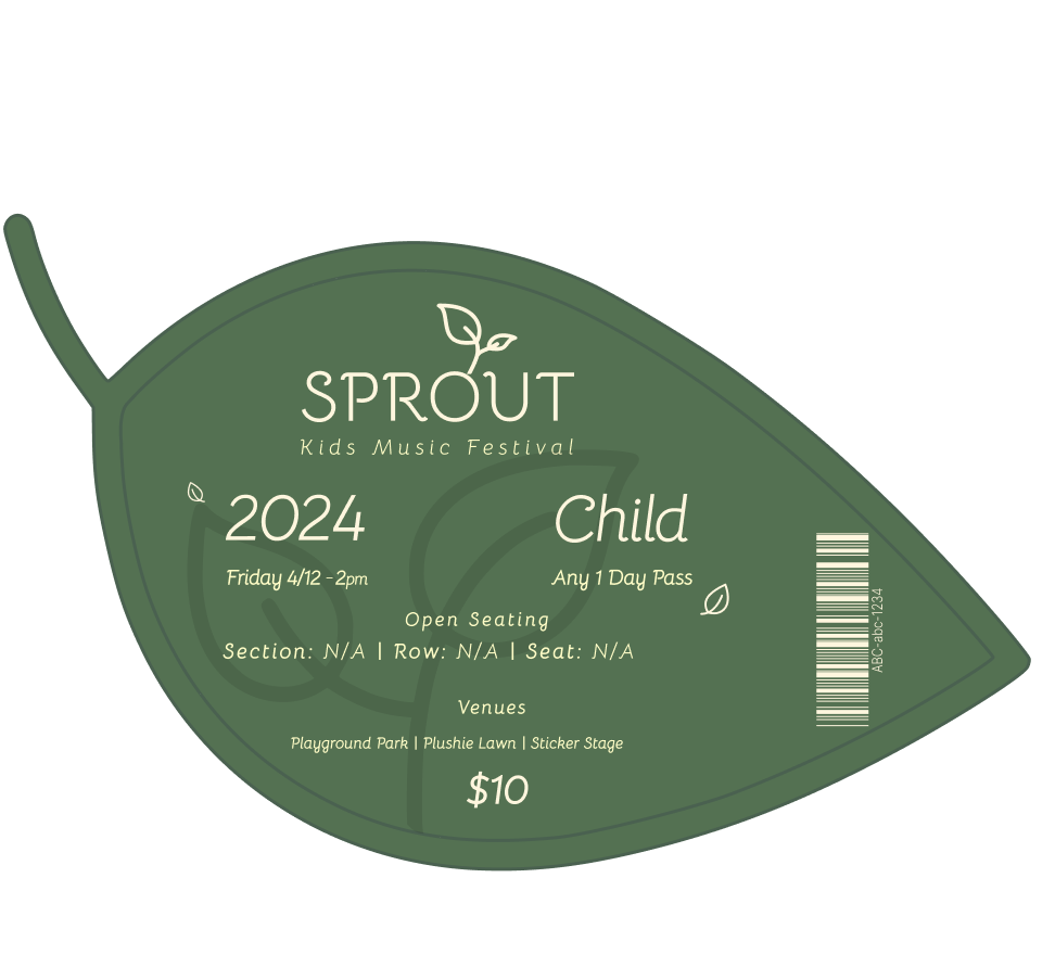
For my ticketing design, 2 different ticket designs were utilized to distinguish adult passes from children passes. Using the leaf as the basis of the ticket was a fun and playful outlook to conventional ticket designs.
Ticketing:
With an abnormal shape, my design wanted to focus more on alignment and simplicity.
Using hierarchy to list the necessary information to be easily presented on the ticket
Avoid misalignment with the barcode by creating a line to help give the code its special area while using that line as a box to help align the rest of the text.
Infographic:
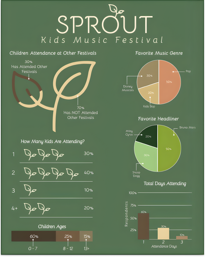
My data visualizations used accessible design for visibility, ensuring that users could contrast one piece of information with another. Alongside using themed icons and visuals to help convey the soft spirit and lightheartedness of the festival.
In my design, I wanted to keep the consistency with the visuals of my data all while making the infographic easy to approach and welcoming. By using visualizations such as:
Pictographs (2x)
Bar Graphs (2x)
Pie Charts (2x)
User Flow & Persona Pathway:
Users have 2 paths to take when purchasing tickets. If the user knew the lineup already and wanted to jump straight into ticketing passes, and whether the user wanted to explore the lineup beforehand
Users will then be given options to purchase 3 different ticket types, adding them to their bag to purchase
Our persona, Olivia (purple bold arrows), will be bringing along her 3 students and will not know the lineup for our user flow and wireframing
Style Tile:
Wanting to continue the theme of softness in the overall design, different shades of “Kombu Green” & Axolotl were in primary & secondary buttons.
With the rounded edges and soft colors, it conveys a soothing feeling for users as they interact with the various buttons, whether that’s during active, hover or default states of the buttons
Wireframes:
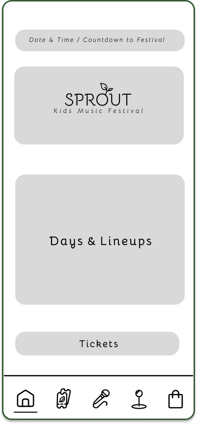
Home Page
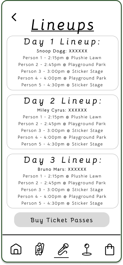
Days & Lineups Page
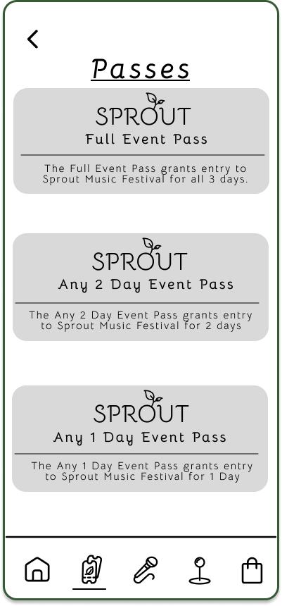
Ticket Selection Page
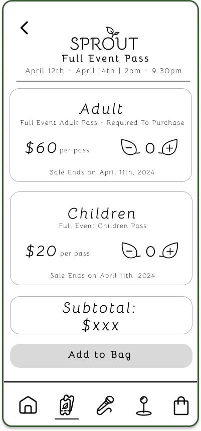
Ticket Type Page
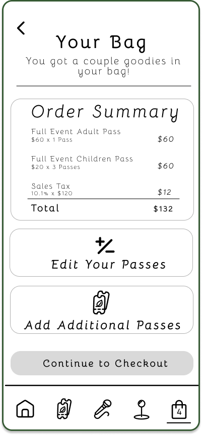
Your Bag Page
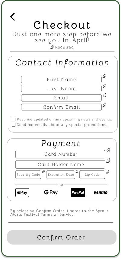
Payment & Information Page
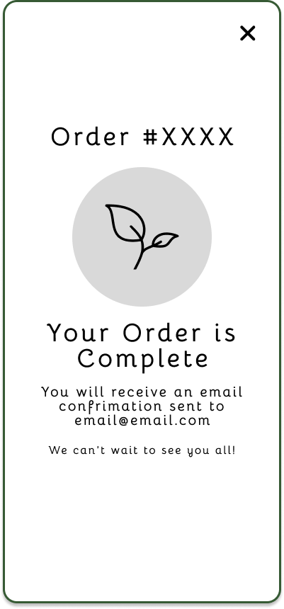
Confirmation Page
In this early fidelity prototype, the interactive sections of the wireframe are labeled with dark-colored sections, indicating to users that this is an area to navigate through.
Following Olivia’s user journey, the wireframes showcase her interactions with Sprout’s interface as she navigates her way to purchase tickets for herself and her three students.
In Olivia’s journey, she lands on the home page. Not knowing any of the lineups she navigates to the lineups page where she can scroll and find all the artists that are performing. After gathering the information displayed, Olivia proceeded to look at tickets for herself and her students. She selects her tickets and adds them to her bag, entering her information and payment method. Afterward, she is presented with a confirmation page about her order with her order number.
While this wireframe garnished compliments of its overall layout and design, user testing unveiled issues with:
Sizing and visibility
Inconsistent formatting
These issues were later accommodated in the final design of the Sprout Kids Music Festival mobile interface, where the finished product entails the spirit and tone that this festival embodies.
Final Design
Extending the color palette to the mobile interface, ‘Kombu Green’ allowed easier visibility while giving ‘Axolotl’ a more warm and inviting outlook for users
Incorporating user feedback into the final first began with the “Days & Lineups” page. With visibility issues along with inconsistent design language, this page became scrollable to enlarge and space out all the information. Accommodating for visibility while not leaving out key details that users needed. The visual presentation was made to be more consistent with the final design with banners over the subject line. Indicating to users that this is not an interactive field unless notified.
Similar adjustments were made to the checkout page. The page became scrollable to aid with visibility while ensuring that users had ample room to input their information.
Overall, the interface captures the festival's soft and open tones. Emphasizing rounded curves and strokes to help convey to users a welcoming space that is not daunting, while intuitive to use and navigate.
Design Logistics:
When festivals mention that young children are invited, I often associate that our future generation was an afterthought to pad statistics on how well a festival is doing. Not making many accommodations that would help our kids to enjoy the full experience. I believe that having a festival that tailors to their interests and passions would create core memories not only for themselves but a recollection of an experience they may reflect on as they grow older. While Sprout is only a concept that lies deeply in my heart, I hope that someday that it will open up new opportunities for children to explore and pursue. Not to mention, a place where parents can giggle and enjoy the expressive vocals that our performances and their high-pitched voice provide.


